Make A Button Look Like A Button
Hi all, Beckton here with a blog post on how to make a button actually look like a button. Put more concisely, making a button look like a button is a best practice for web design. Even if you aren’t a web designer, these usability principles can be applied almost anywhere.
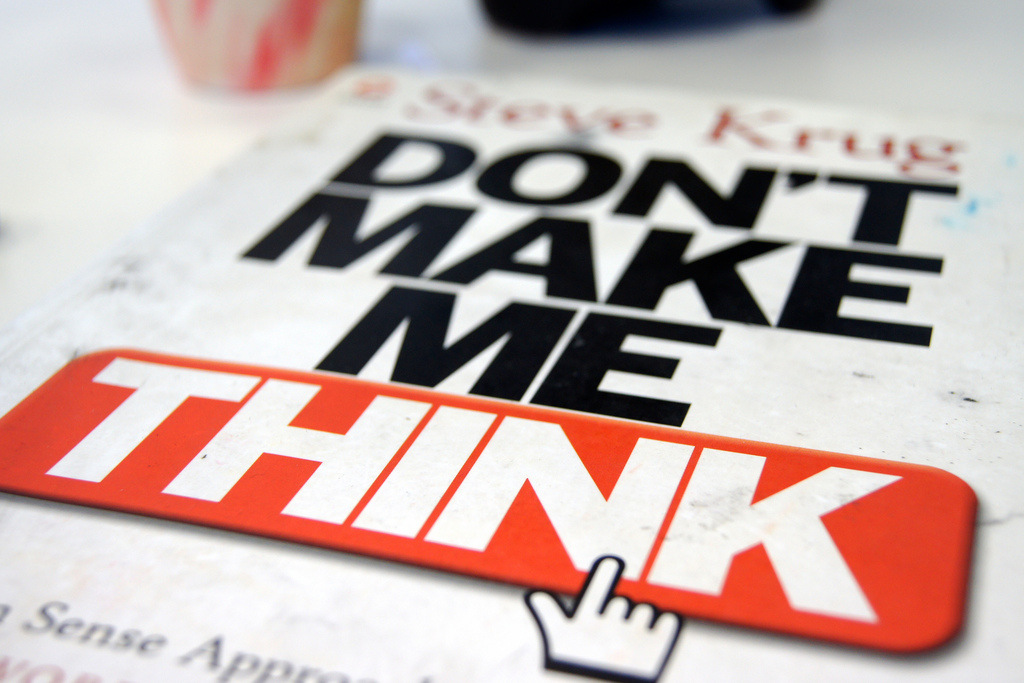
The Ten Golden Rules team always refers to a great web design and usability book called “Don’t Make Me Think” by Steve Krug. When designing web pages your goal should be to make it really easy (and obvious) for the user to do what they want to do.
Qualities of Good Design
Good design, whether it be on a website or in an advertisement, is about making everything clear to the user. On an advertisement you want to make it clear what you want them to do, and entice them to do it. On a website if a user can’t easily find what they want, they will likely be frustrated and there goes a potential customer. It is crucial to get design right as it can make or break an experience with your company.
Good design doesn’t have to be fancy or complex. Simple changes can make a web page more usable. Put function first above form. Below, I have illustrated this with a basic example of a contact us form.
Modifying an Example
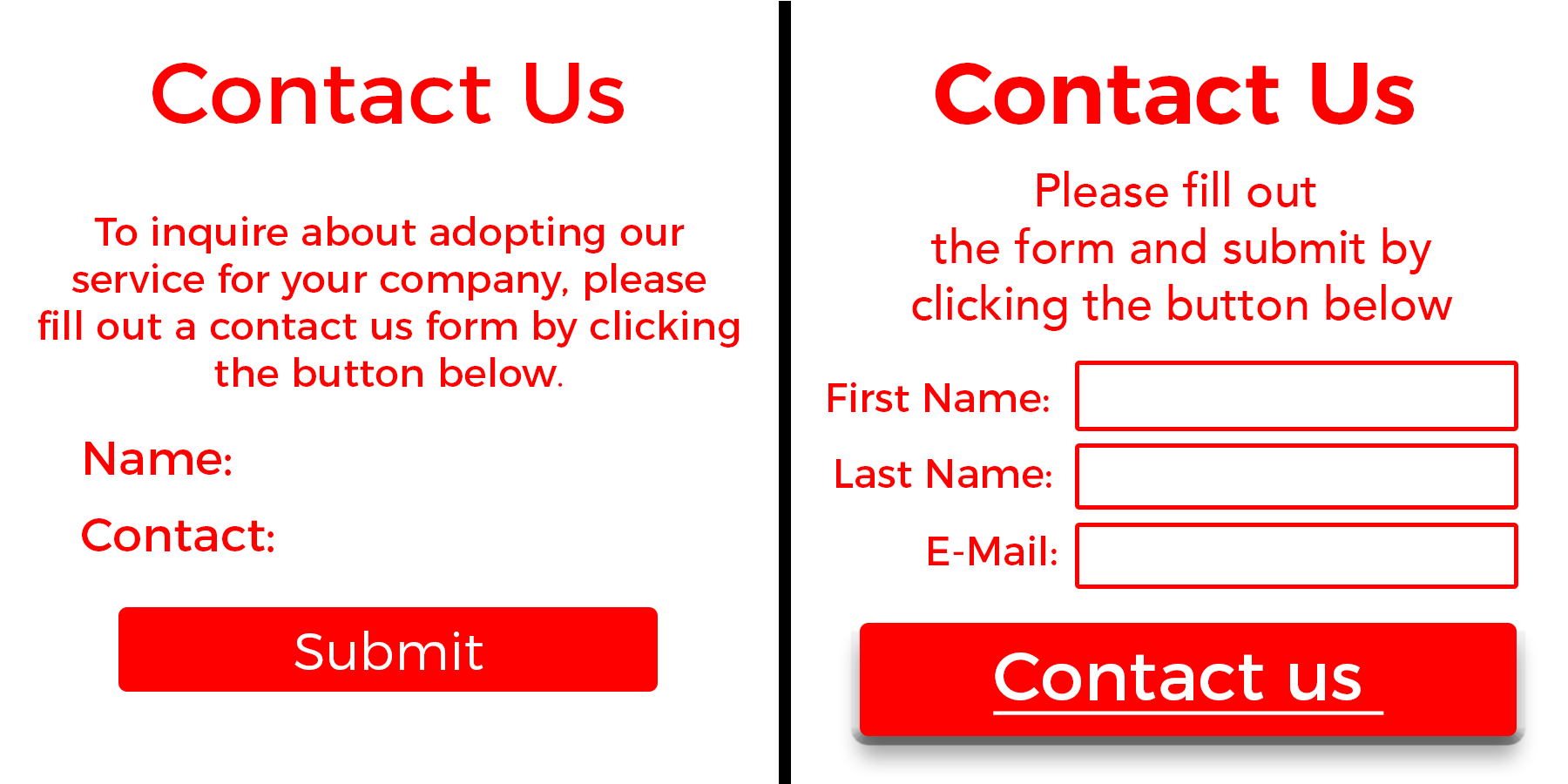
On the left is the original contact us section. It looks well designed at first glance. However there are some small changes that would make it far more effective. First of all, by editing the copy down, making the form very obvious, and by making the button look more like a clickable web button, it puts the focus on the action we want the user to take.
Previously a lot of the focus was on the header saying contact us and not so much on the form and the button. Even though the header is now bolder and grabs the users attention, it is more proportional and doesn’t distract from the rest of the form. Secondly, with the button itself, it didn’t look that much like a button, as it was just a flat box. With the addition of a bevel and small shadow, it now looks like a clickable button at first glance. There were also minor refinements made to the text and fixing the spacing, all of it comes together to make the form much more approachable and directing the user to what we want.
With a few minor changes in design, we are able to create a better experience for the user. This new design lets them find what they want quicker, and take the action that we’d like them to do. That is what good design is about, not just looking nice, it creates a seamless experience for the user and channels their focus. So now, our button really does look like a button.